-
Shop
- Advanced Technologies
- AI Skills for Creators & Freelancers
- AI Client Management
- AI Ethics
- AI Mindset
- AI Tools & Prompts
- AI Writing & Content Creation
- Audio, Voice & Music
- Design & Visual Creation
- Email, Messaging & Communication
- Freelancing & Business
- Marketing, Ads & Conversion
- Productivity, Workflow & Automation
- SEO & Search Optimization
- Social Media Content & Growth
- Strategy, Planning & Analytics
- Video Creation & Editing
- AI Skills Mastery 2026 Collection
- Bathroom
- Beauty
- Best Sellers
- Car Accessories
- Dating & Social Confidence
- Dating & Social Skills
- Digital Resources
- Dresses
- Education & Learning
- Family & Parenting
- Fashion
- Fashion & Style
- Fitness
- Furniture
- Gadgets
- Health & Beauty
- Health & Wellness
- Home & Garden
- Home & Kitchen
- Home Electronics
- Kids & Babies
- Kitchen
- Lighting
- Parenting
- Patio, Lawn & Garden
- Personal Growth
- Pet Care
- Pet Lifestyle & Wellness
- Pet Supplies
- Pets
- Sport & Outdoors
- Swimwear
- Tops
- Travel
- Wealth
Mix Kitchen Patterns: A No-Clutter Print Checklist
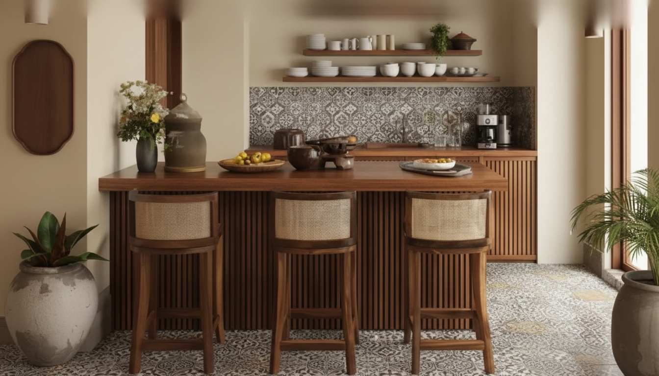
Start With the Non‑Negotiables in the Room
Pattern mixing works best when it responds to what’s already fixed. Before choosing a single towel, rug, or curtain, take two minutes to “read” your kitchen like a designer would: identify what stays, what moves, and what already functions like a pattern. For more guidance, see How to Layer Patterns and Colors in Kitchen Designs.
- List what stays: cabinetry color, countertops, existing tile, appliances, and fixed lighting finishes.
- Note the largest “pattern” already present (stone veining, wood grain, floor tile layout, brick). Treat it like a pattern when planning prints.
- Choose one visual anchor area—backsplash zone, window wall, or island seating area—then build other patterns around it.
- Decide the mood in one line (for example: “bright and crisp,” “warm and vintage,” “calm and modern”). Use it as a filter for every print.
Kitchen Pattern Inventory (Fill Before Buying Anything)
| Surface/Item | Current color(s) | Pattern type | Scale (S/M/L) | Keep / Replace |
|---|---|---|---|---|
| Floor | Wood grain / Tile / Solid | |||
| Backsplash | Subway / Mosaic / Geometric / Solid | |||
| Countertop | Veining / Speckle / Solid | |||
| Window treatment | Stripe / Floral / Solid / Texture | |||
| Rug/runner | Vintage / Geometric / Solid / Texture | |||
| Textiles (towels, mitts) | Check / Stripe / Print / Solid |
The Three-Part Formula: Color, Scale, and Type
When a kitchen feels “busy,” it’s usually because one of three levers is out of balance: color is too scattered, scale is too similar, or every print belongs to the same family. Use this simple formula to keep the mix intentional.
- Color rule: keep most patterns inside a tight palette (2–3 main colors + 1 accent). Repeat at least one color across all prints.
- Scale rule: mix at least two different scales—one large, one small. Add medium only if there’s enough solid space to rest the eye.
- Type rule: vary categories for contrast (one geometric + one organic/floral + one simple stripe is a reliable trio).
- Breathing room: keep at least one major element solid or near-solid (cabinetry, walls, or counters) so the patterns look chosen, not crowded.
If you want a deeper refresher on why this works, the Getty’s overview of design principles like balance and rhythm is a great, quick read.
Quick Pattern Categories for Kitchens
| Category | Examples | Best for | Pairs well with |
|---|---|---|---|
| Geometric | Chevrons, hexes, lattice | Backsplashes, rugs | Stripes, solids, subtle textures |
| Organic | Florals, botanicals, fruit motifs | Curtains, art, towels | Simple checks, clean geometrics |
| Linear | Stripes, pinstripes, ticking | Cafe curtains, seat cushions | Florals, small geometrics |
| Check/Plaid | Gingham, buffalo check | Textiles, table linens | Florals, stripes, simple tile |
| Texture-as-pattern | Woven, slub, nubby linens | Runners, baskets, shades | Any bold print |
A Simple Checklist for Mixing Prints Without Clutter
Use this as a repeatable order of operations. The goal isn’t to “match”; it’s to make every pattern look like it belongs to the same plan.
- Pick a base neutral (warm white, soft gray, greige) that shows up on at least one large surface or as a background in a print.
- Choose one hero pattern (largest impact) and keep it to one main area (curtains or runner or statement tile—not all three).
- Add one supporting pattern in a different scale (if the hero is large, make the support small).
- Add one bridge pattern/texture to connect everything (thin stripe, small check, woven texture).
- Repeat a shape or motif once (arches, scallops, circles, leaves) to create continuity.
- Cap the count: 3 patterns + 1 texture is plenty for most kitchens.
- Use a “two-views test”: stand at the entry and at the sink—if your eye bounces, reduce contrast or swap one print for a quieter scale.
Want a printable version you can keep on your phone while shopping? The Mixing Prints Without the Chaos – How to Mix Patterns in Kitchen Checklist turns the steps into a quick planner you can reuse each season.
Kitchen-Specific Placement: Where Patterns Work Best
Kitchens are pattern-heavy by nature: grout lines, cabinet rails, appliance edges, and countertop movement create visual “noise” before you add decor. These placement guidelines keep the mix confident.
If you’re also balancing function (walkways, clearances, and traffic flow), NKBA’s kitchen planning guidelines are a helpful reference when choosing runner sizes and placements.
Ready-to-Use Pattern Combos (Swap Colors to Match Your Kitchen)
Easy add-ons that won’t tip into “too much”
- A second checklist for other tight spaces can keep your whole home consistent: Luxe Hacks for Small Closets Checklist (digital download).
- When you rotate runners and rugs seasonally, crumbs and pet hair can make textures look messy fast—keeping floors and textiles crisp helps patterns read cleaner. If you’re due for an upgrade, consider the 20Kpa Cordless Stick Vacuum Cleaner for Hard Floor, Carpet & Pet Hair or the Cordless Vacuum Cleaner, 235W Brushless Motor, 40Min Runtime for quick daily resets.
A One-Page Planner to Keep Decisions Easy
FAQ
How many patterns can a kitchen handle without looking busy?
A reliable rule of thumb is 3 patterns plus 1 texture. Smaller kitchens or rooms with strong countertop veining often look best with just 2 patterns, while open layouts can handle 4 patterns if there are plenty of solid surfaces to create visual rest.
What if the countertop already has strong veining or movement?
Treat the veining as one of your patterns and keep the backsplash calmer. Lean on texture, thin stripes, or small checks for textiles, and repeat one color pulled from the stone so everything feels connected.
Do patterns have to match exactly to look coordinated?
No—coordination comes from a shared palette, a repeated motif or shape, and varied scale. Exact matching can actually look flat; a little contrast is what makes the mix feel layered and intentional.
Recommended for you


Was this article helpful?
Yes
No








Leave a comment