Cozy Table Aesthetic: AI Training Checklist for Consistency
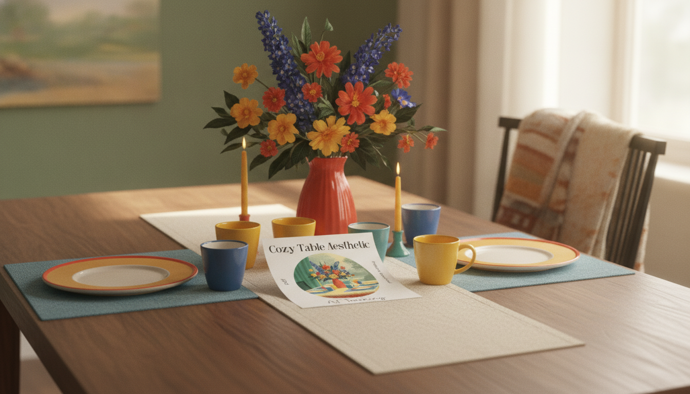
What a “cozy table” aesthetic is (and what it isn’t)
A “cozy table” aesthetic is the visual feeling of a quiet, warm moment at a tabletop—inviting light, tactile surfaces, and a styled-but-natural arrangement that looks lived-in without looking messy. When creators try to reproduce it across seasons, new product lines, or different layouts, the look often drifts into either bland minimalism or busy clutter. A consistent training checklist helps keep the scene recognizable no matter what’s on the table.
The core cues tend to stay the same: warm or neutral color temperature, soft shadows, and materials that read as touchable (linen, wood grain, stoneware, paper). Common scene elements include a mug or teacup, a plate or pastry, candlelight, an open book, a few seasonal stems, and a woven placemat—plus intentional imperfections like crumbs, folds, and slightly uneven edges.
What usually breaks the vibe: harsh flash, high-saturation props, overly symmetrical “product grid” layouts, reflective plastic, and busy patterned surfaces competing with the hero objects. When training an aesthetic, these are the first things to label as “out of bounds.”
What’s inside the Cozy Table Aesthetic AI Training Checklist
The Cozy Table Aesthetic AI Training Checklist (digital download) is built as a structured, printable workflow that turns a personal moodboard into a repeatable visual system. It focuses on four practical areas that tend to make or break consistency:
- Style boundary rules: defining what “counts” as cozy (and what doesn’t), so you don’t accidentally blend farmhouse, ultra-modern, and studio-white looks together.
- Dataset curation: ensuring image variety without style drift, removing duplicates, and setting minimum quality standards so texture and lighting survive training.
- Labeling and organization: a simple way to tag props, lighting, materials, and composition so future dataset updates remain compatible.
- Training + testing loops: quick validation runs, side-by-side comparisons, and controlled changes so you can diagnose what improved (or broke) the look.
Cozy table style boundary guide
| Decision area | Keep it cozy | Usually avoid |
|---|---|---|
| Lighting | Warm window light, candle glow, soft shadow falloff | On-camera flash, harsh overhead LEDs, blue cast |
| Palette | Cream, oat, caramel, warm gray, muted green | Neon accents, high-contrast primaries |
| Materials | Linen, wood, matte ceramic, paper, stone | Glossy plastic, mirrored chrome, noisy acrylic |
| Composition | Natural clusters, gentle asymmetry, breathable negative space | Perfect symmetry, cluttered backgrounds, too many hero objects |
| Props | Books, pastries, hand-thrown mugs, simple florals | Tech-heavy props, branded packaging noise, overly trendy novelty items |
Step-by-step checklist to train on your favorite cozy table looks
1) Define your “signature” in 1–2 sentences
Write a compact scene description you can reuse as a north star, such as: “quiet morning tea on rumpled linen with warm wood, matte ceramics, and soft window light.” If an image wouldn’t fit that sentence, don’t collect it.
2) Collect reference images with controlled variety
A strong cozy dataset has variety that stays inside your boundary. Aim for multiple angles (overhead and 45°), different table surfaces (oak, walnut, pale stone), and a range of object combinations (mug + book, pastry + plate, candle + stems), while keeping lighting and palette consistent.
3) Filter hard to prevent style drift
4) Standardize your images before training
5) Tag what matters (and keep tags simple)
6) Train small first, then scale
7) Iterate with one change at a time
8) Lock a version and archive your notes
Training options and when to use each
| Approach | Best for | Watch-outs |
|---|---|---|
| Style-first training | A cohesive cozy mood across many tabletop compositions | Can become generic if references are too broad |
| Object/brand-first training | Repeated hero object in many cozy scenes | May overfit and repeat the same arrangement |
| Two-phase (style then object) | Consistent aesthetic plus a recognizable signature element | Requires clean separation of datasets and notes |
Quality checks before using outputs in real projects
- Cohesion: lighting direction should match shadow placement, and color temperature should stay warm across the frame.
- Texture realism: linen should read woven, wood grain should look natural, and ceramics should show believable matte highlights rather than plastic shine.
- Scale + perspective: props should share a consistent camera angle and horizon; avoid scenes where cups, plates, and books feel mismatched in size.
- Clutter control: cozy reads as curated; regenerate outputs that add random extra items, busy patterns, or distracting background objects.
- Brand safety: avoid accidental logos, misleading packaging, or identifiable private imagery. Risk-aware workflows are increasingly standard; see the NIST AI Risk Management Framework (AI RMF 1.0), the U.S. Copyright Office guidance on AI, and the OECD AI Principles for broader context.
Ways creators and designers can use a consistent cozy table style
If part of your cozy workflow involves keeping your physical props and backdrops organized between shoots, the Luxe Hacks for Small Closets Checklist (digital download) can help streamline storage so linens, ceramics, and surfaces stay easy to rotate.
FAQ
How many reference images are enough for a cozy table style?
A focused starter set can work with roughly 25–60 high-quality, highly consistent images, especially for testing. For stronger consistency across more compositions and seasons, many creators build toward 80–200 images, scaling up only after a small test run produces the warmth and texture they want.
Why do results look cluttered or stop feeling “cozy” after training?
This usually happens when the dataset mixes aesthetics (lighting shifts, modern glossy props, busy backgrounds) or when prop variety grows faster than the style rules. Remove off-style images, reinforce “anchor” references with the clearest cozy lighting and materials, and reduce competing patterns so the model prioritizes calm, curated scenes.
Can the checklist be used for different cozy themes like autumn, hygge, or minimalist café tables?
Yes—keep a stable base style (lighting, materials, camera angle, negative space) and add a smaller, clearly separated seasonal subset for colors and props. That way you can introduce autumn tones or café minimalism without rewriting the underlying “cozy” rules.











Leave a comment